Principles applied to the elements of design that bring them together into one design. How one applies these principles determines how successful a design may be.
As William Lidwell's stated in Universal Principles of Design:
The best designers sometimes disregard the principles of design. When they do so, however, there is usually some compensating merit attained at the cost of the violation. Unless you are certain of doing as well, it is best to abide by the principles.
This is the REFERENCE (text)Our work is to use these elements of design by using square grid to make one design on a board.

Asymmetrical balance occurs when several smaller items on one side are balanced by a large item on the other side, or smaller items are placed further away from the center of the screen than larger items. One darker item may need to be balanced by several lighter items.
My work

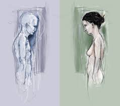
War of women.
Inspiration from toilet signage. :)
It is not equally balance as the weight of the woman are not the same. One is heavier than the other. But still there is a sense of balance.
Inspiration from toilet signage. :)
It is not equally balance as the weight of the woman are not the same. One is heavier than the other. But still there is a sense of balance.
2. Symmetrical balance (Formal balance)
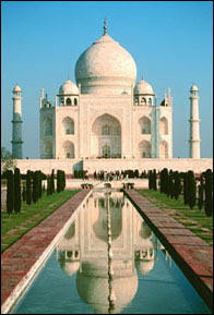
Symmetrical balance is mirror image balance. If you draw a line down the center of the page, all the objects on one side of the screen are mirrored on the other side (they may not be identical objects, but they are similar in terms of numbers of objects, colors and other elements). Sometimes they are completely identical.
My Work

Pouring water.
I have used the simplest definition of symmetrical balance, which is both sides are identical to each other. It has a sense of movement of water flowing.
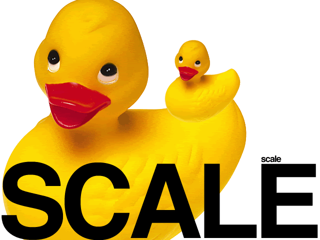
Dimensional element's defined by other elements of design-size relative to other art, its surroundings, or in relation to human size. Unusual or even unexpected scale can certainly be used as a attention grabber. Scale can attract in different ways. It can be use to draw attention to the unexpected or exaggerated - this is often the case in advertising.

My Work
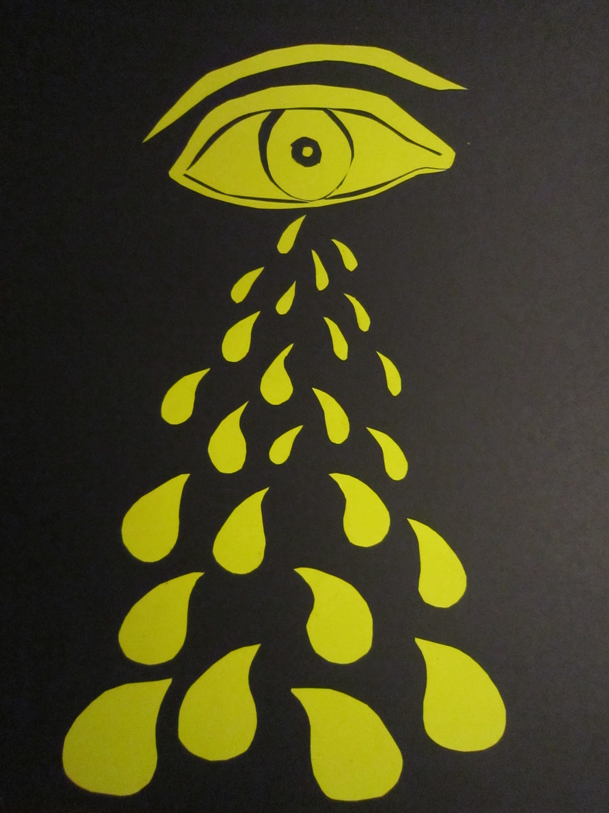
Liters of tear drops.
It has the effect of the larger water drops are coming to the front while the small ones are at the back.
REFERENCE for the definition.


My Work
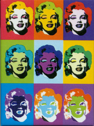
4. Rhythm and Repetition
A recurrence or repetition of one or more elements within a visual composition with the goal of creating harmony i.e. a rhythmic feeling. In visual arts it is the flow and movement of graphical element's). It is a principle based on repetition. It a distinct reputation of elements that are the same or slightly changed.
My Work

Present of surprises!
It fulfills the principle because the square girds and the lines are being repeated. The way that the square grids are arranged and the shape of the lines create a sense of movement. I have slightly change the lines of each boxes.
Here is the REFERENCE for the definition.

5. Dominance
Dominance is created by contrasting size, positioning, color, style, or shape. The focal point should dominate the design with scale and contrast without sacrificing the unity of the whole.
My Work

A book holds a house of gold. (书中自有黄金屋)
Inspiration from the Chinese proverb. The house is the dominance of the whole picture. It has the biggest scale and others are complementing the house.
REFERENCE for the definition

6. Unity and variety
Harmony is the condition of agreement with the use of all visual elements within a composition. A number of methods promote Unity. These include:
-Proximity
-Repetition
-Continuation element continues to use the line, an edge, or a direction.

My Work

One world!
We are living in a world of variety but still we are in unity. Various of ethnics, culture and language. We don't group animals, plants and objects that surround us everyday as the same level with us. But when we see from a different perspective, still we are ONE. Variety of creatures on the world, Unite as we are living on the same world.
REFERENCE for the definition
7. Dynamic and Static

- Dynamics is the arrangement of visual elements in a composition to suggest the illusion of movement or direction. The effective use of dynamics in a design can add an emotive characteristic to your design making it appear restful and calming or active and energetic.
- Static composition means that the majority of lines on a page are horizontal or vertical. The theory says that horizontal and vertical lines have a soothing, calm, or tranquil effect on the observer
MY WORK

Tunnel of cars. [Dynamic]
I have use directional method. It is the use of graphic elements used in such as way that implies a visual connection to lead the eyes to move in a particular direction.

Food glorious food. [static]
I have arrange the square grid in horizontal and vertical way. Although is not in line and in sequence, it is still static. It won't give you an illusion of moving.
1) REFERENCE of text
2) REFERENCE of text and pictures
In conclusion: These principles should be fully utilize in order to become a good designer.
No comments:
Post a Comment